Demo 1: Functions, Plotting, and Partial Derivatives#
Demo by Christian Mikkelstrup and Hans Henrik Hermansen. Revised March 2026 by shsp.
from sympy import *
from dtumathtools import *
init_printing()
Welcome back after Christmas and January and welcome to a Spring with Mathematics 1b. There will be a whole lot of new mathematical curriculum, and among other things a whole lot of 3D plots! For this we have developed the Python library dtumathtools, which will accompany you during the semester. It contains dtuplot, designed for efficient plotting, as well as several good helper functions. You should have dtumathtools installed on your computer already from Mathematics a; if not, then run the command in a terminal:
conda install dtumathtools==2025.2.0 # Replace conda with pip or pip3 if you use those tools for library import instead
A Function in One Variable#
Defining Functions and Evaluating Values#
We can define a mathematical function, such as \(f: \mathbb{R} \to \mathbb{R}\), \(f(x)=x \operatorname{e}^x\), as a Python function using the following familiar structure with the def command:
def f(x):
    return x * exp(x)
\(f\) is then evaluated at the point \(x = -2\) by typing:
f(-2)

whose decimal value is:
f(-2).evalf()

It is often not necessary to define our mathematical functions as Python functions with the def command. We might prefer simply saving the functional expression as a symbol:
x = symbols('x', real = True)   # Define x as a symbolic (Sympy) variable (we apply the assumption real=True, since R -> R, although this is not strictly necessary here)
f_expr = x * exp(x)
f_expr

This time, typing f(-2) of course won’t work so we will instead use a substitution:
f_expr.subs(x, -2)
Note that a Python function and a mathematical function conceptually are different things (a Python function doesn’t have to represent a mathematical function). Our use of the term “function” in these demos will always refer to a mathematical function, and we will explicitly write “Python function” otherwise.
Derivatives, Limits, and Plots#
The function \(f\) can be differentiated by:
f_prime = f_expr.diff(x)
f_prime

We can investigate limits, such as for \(x \to -\infty\), \(x \to \infty\), and \(x \to -2\), with the commands:
f_expr.limit(x, -oo), f_expr.limit(x, oo), f_expr.limit(x, -2)
It should be no surprise that \(\displaystyle\lim_{x \to -2} f(x) = f(-2)\), since the function is continuous.
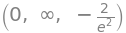
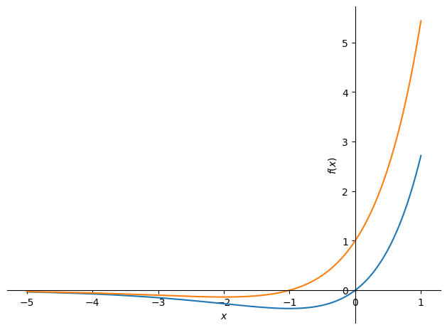
We can plot the graphs of the function and its derivative in the same window by:
plot(f_expr, f_prime, (x, -5, 1))
<sympy.plotting.backends.matplotlibbackend.matplotlib.MatplotlibBackend at 0x7fce8e0d7190>
Compare this plot from the built-in plot command with the following from dtuplot:
dtuplot.plot(f_expr, f_prime, (x, -5, 1))
<spb.backends.matplotlib.matplotlib.MatplotlibBackend at 0x7fce6e20dc90>
We see that certain plot properties are set by default, such as a legend and a grid.
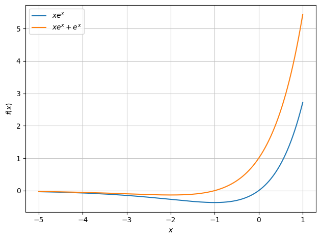
Piecewise-Defined Functions#
A little more complicated example could be the piecewise-defined function \(g: \mathbb{R} \to \mathbb{R}\),
which is harder to directly save as a simple symbol. For this, we might prefer defining it as a Python function by:
def g(x):
    if x < 0:
        return -x
    else:
        return exp(x)
But with the Sympy library at hand, we can in this specific case avoid Python function definitions by using the convenient command:
g_expr = Piecewise((-x, x < 0), (exp(x), x >= 0))
g_expr
which evaluates as expected:
g_expr.subs(x, -2)

Plotting a piecewise-defined function is no different from plotting other functions:
dtuplot.plot(g_expr,(x,-5,2), ylabel='g(x)')
<spb.backends.matplotlib.matplotlib.MatplotlibBackend at 0x7fce6de725d0>
The graph indicates a discontinuity (a “jump” within the domain) at \(x = 0\). Keep in mind, though, that seeing this on a graph is just an indication; we cannot draw this conclusion based purely on what we see on a plot, as we might be tricked by an unlucky zoom level, camera orientation or more. Unfortunately, Python/CAS does not have any way of proving or disproving continuity for us. For example, although a function isn’t differentiable at a discontinuous point, Sympy will carry out differentiation without raising any suspicion:
g_expr.diff(x)
For proofs of continuity or differentiability, the manual way is the certain way, e.g. disproving by finding a counterexample or proving using an epsilon-delta argument and the like.
Partial Derivatives using diff#
For functions of multiple variables we will now introduce the partial derivative. Consider the function:
x, y = symbols('x y')
f = x*y**2+x
f

We now differentiate it using the diff command, but since we are dealing with a function of two variables we must choose with respect to which variable we wish to differentiate:
f.diff(x), f.diff(y)
These are the partial derivatives, \(\frac{\partial f}{\partial x}\) and \(\frac{\partial f}{\partial y}\). Each partial derivative can of course be differentiated one more time with respect to each variable, yielding the second-order partial derivatives. This function of two variables has four such second-order partial derivatives to consider:
f.diff(x).diff(x), f.diff(x).diff(y), f.diff(y).diff(x), f.diff(y).diff(y)

More directly, these can also be found by:
f.diff(x,2), f.diff(y,2), f.diff(x,y), f.diff(y,x)

We can substitute in values for \(x\) and \(y\) and calculate, for example, \(\frac{\partial}{\partial x}f(-2,3)\):
f.diff(x).subs({x:-2,y:3})

or \(\frac{\partial^2}{\partial y\partial x}f(5,-13)\):
f.diff(x,y).subs({x:5,y:-13})

Plots#
Changing Orientation#
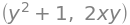
We will now consider plots of functions in two variables, hence plotting in 3D! (Note that with more than two variables, a plot of the graph requires more than three axes, making plotting the graph impossible.) Plotting graphs in 3D is easy, and we can even choose from which angle to view them. By default, dtuplot will choose a fitting angle, but if we wish to inspect the graph from some other chosen angle, then camera can be used. Try changing the values of elev and azim in the follow plot command:
f = 4-x**2-y**2

p=dtuplot.plot3d(f, (x,-3,3),(y,-3,3), camera = {"elev": 25, "azim": 45})
Interactive Plots#
The plot above was generated as a static PNG-file, which is great if you wish to print or export the Notebook as a PDF, or if you need to copy the plot as a image to your project report or so. All plots will be static if we don’t do anything or if we use the command %matplotlib inline.
If we instead run the command %matplotlib qt (which in the following cell has been commented out; try running the cell after removing #), then we enable interactive plots. All subsequent plots, will then “pop out” of our VS Code editor and can be rotated by pressing-and-dragging with the cursor.
# %matplotlib qt
Running this command changes the backend of matplotlib to Qt, affecting the entire Jupyter kernel, which means that all plots from now on will open in a separate window rather than being printed directly on the Jupyter Notebook page. This affects all later plots in the same session, also other Jupyter Notebooks that use the same kernel, but is not permanent and will be reset when the kernel is restarted. To switch back to default (inline) plotting without a kernel restart, simply run the command: %matplotlib inline.
Note that %matplotlib qt only works when running Python on your own computer. It will, for instance, not work if you run Python on an online server like Google Colab. In such cases you must use widgets instead, such as %matplotlib ipympl. However, this requires installation of an extra package, in this case ipympl.
Overview of commands:
# %matplotlib inline        # For static plots
# %matplotlib qt            # QT (cute) for interactive "pop-out" plots
# %matplotlib ipympl        # Widget/ipynpl for interactive inline plots (not as stable as QT, may require a restart of the kernel)
# %matplotlib --list        # List of all backends
Aesthetics#
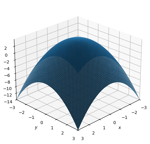
Changing how plots generated with dtuplot look can be done by setting rendering keywords with rendering_kw={...}. With this, you can specify rendering settings for color, alpha (transparency), and more:
dtuplot.plot3d(f, (x,-3,3),(y,-3,3), wireframe = True, rendering_kw = {"color": "red", "alpha": 0.5})
<spb.backends.matplotlib.matplotlib.MatplotlibBackend at 0x7fce6decfb90>
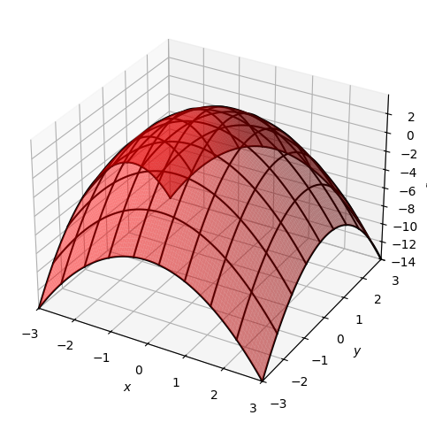
Some aesthetic choices are special enough to have their own argument outside of rendering_kw, such as wireframe as used in the above plot, and use_cm which activates a color mapping in the below plot:
p=dtuplot.plot3d(f, (x,-3,3),(y,-3,3), use_cm=True, legend=True)
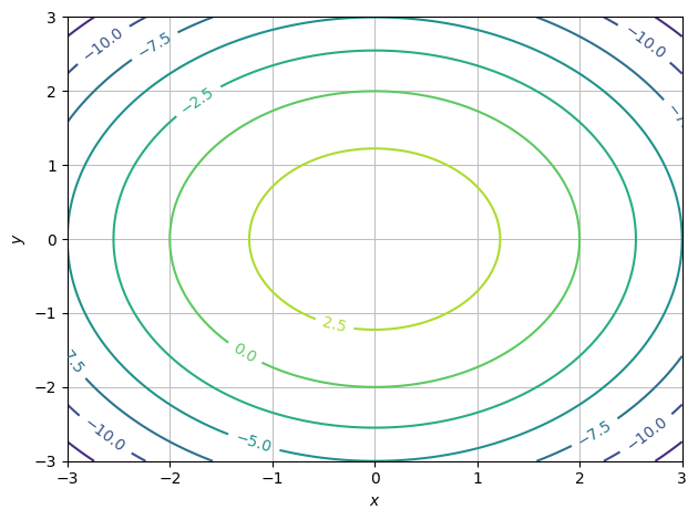
Level Sets#
When dealing with functions of two or three variables we might prefer visualizing the function with a counter plot (that is, plotting level sets) as an alternative to plotting the graph. Note the difference in dimensionality: plotting the graph of scalar functions requires an extra axis on top of the axes for each variable, which is not the case for a contour plot of level sets. For a function in two variables, a contour plot will be 2D, whereas a plot of its graph will be a 3D plot:
dtuplot.plot_contour(f, (x,-3,3),(y,-3,3), is_filled=False)
<spb.backends.matplotlib.matplotlib.MatplotlibBackend at 0x7fce67342950>
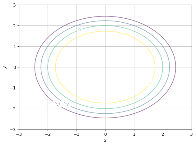
We can choose the exact function values to show level curves for (just remember that in order for contour plots to properly visualize “steepness”, you will want an even spacing between all levels):
z_levels = [-2,-1,0,1]
dtuplot.plot_contour(f, (x,-3,3),(y,-3,3), rendering_kw={"levels":z_levels, "alpha":0.5}, is_filled=False)
<spb.backends.matplotlib.matplotlib.MatplotlibBackend at 0x7fce6dce3990>
The Gradient and Gradient Vector Fields#
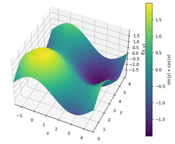
Consider the function \(f:\mathbb R^2\to\mathbb R\):
It’s graph can be visualized as a 2-dimensional surface in a 3D coordinate system:
f = cos(x)+sin(y)
p = dtuplot.plot3d(f, (x,-pi/2,3/2*pi),(y,0,2*pi),use_cm=True, camera={"elev":45, "azim":-65}, legend=True)
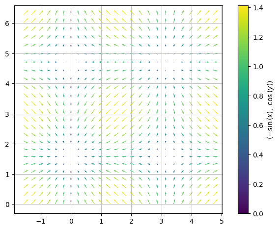
The gradient of \(f\) at a point \((x,y)\) is a vector that we symbolize with the nabla symbol as \(\nabla f(x,y)\). It is constructed from the two partial derivatives of \(f\) as follows:
nf = Matrix([f.diff(x), f.diff(y)])
nf
The gradient can also be computed using dtutools.gradient (although it should be noted that we with this command not always have full control over the order in which the variables are used).
dtutools.gradient(f)
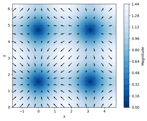
The above gradient expression defines a vector at every point, which means that we can consider this gradient as a vector function \(\nabla f:\mathbb R^2\to \mathbb R^2\) expressing a set of vectors spread over the \((x,y)\) plane. This is called a vector field, in this case particularly a gradient vector field. We plot this as follows:
dtuplot.plot_vector(nf, (x,-pi/2,3/2*pi),(y,0,2*pi),scalar=False)
<spb.backends.matplotlib.matplotlib.MatplotlibBackend at 0x7fce67695850>
or if we want to get fancy (note that the aesthetics keywords have been separated such that arrows and contours are styled separately, giving more control):
dtuplot.plot_vector(nf, (x,-pi/2,3/2*pi),(y,0,2*pi),
    quiver_kw={"color":"black"},
    contour_kw={"cmap": "Blues_r", "levels": 20},
    grid=False, xlabel="x", ylabel="y",n=15)
<spb.backends.matplotlib.matplotlib.MatplotlibBackend at 0x7fce66c1b050>