Theme 2: Data Matrices and Dimensional Reduction#
In this Theme project we will be working with “data” matrices in Numpy and a method known as Principal Component Analysis (PCA). Principal Component Analysis (PCA) is a mathematical (statistical) method used for reducing the dimensionality of data. The method tries to identify the most important variations in a data set by transforming the original variables into new, independent “components”. In the “language” of Mathematics 1b, we find a new orthonormal basis, choose the important basis directions and project the data onto the subspace spanned by these basis vectors. This makes it easier to visualize and analyze complicated data. PCA is particularly useful when working with large data sets with many variables where it is possible to describe the essential information in the data with just a few variables. This can help identify the most relevant properties and reduce “noise” in the data.
Before introducing the method, we must first learn how to make matrix operations in Numpy, as this is slightly different from Sympy. Numpy (Numerical Python) is a Python package that makes it easier to work with numerical data. It is indispensible for engineering students as it provides effective tools for mathematical analysis, statistical analysis, and data analysis. It can become very useful in the project period later in the course, and of those reasons we will introduce it in this Theme Exercise. Numpy contains a central data structure called an “array” that can be thought of as an \(n\)-dimensional “container” for numbers. We will consider these arrays as matrices and vectors.
By “data” matrices we simply mean matrices containing decimal numbers (meaning, numerical matrices). Such matrices may often represent physical quantities such as an \(n \times 2\) matrix \(X\) with two columns that contain, respectively, heights and weights of \(n\) test subjects. The purpose of the exercise is not for us derive the PCA method, nor understand it from a statistical perspective. Instead, we will apply it to “understand” our data and illustrate the concepts of eigenvector bases and orthogonal projections of data sets
This Theme Exercise is structured with the following steps:
Matrix computations in Sympy, Numpy, and Maple
Import of data sets and visualizations
PCA of data sets in 2D
Making your own data set in higher dimensions
Matrix Operations in Computer Software#
We will first have a look at performing various matrix operations in Sympy, Numpy, and Maple with matrices and vectors of relatively small sizes. Some of the matrix operations are known from mathematics, such as matrix multiplication, matrix addition, etc., while others (in particular in Numpy) are all new. It is very easy to do something in Numpy that makes no sense, so it is a good idea to check your code with small examples that can be checked by hand calculations.
from sympy import Matrix, init_printing
import numpy as np
import matplotlib.pyplot as plt
init_printing()
First, define \(A \in \mathbb{R}^{3 \times 3}\) and \(\pmb{x} \in \mathbb{R}^{3 \times 1}\) in the three programs. Sympy and Numpy can use the same Jupyter Notebook; the Maple code can be copy-pasted to Maple.
If you do not have Maple by Maplesoft installed or if you have never used this software before, then you do not need to do the calculations and coding in Maple.
In Sympy:
A = Matrix([[1, 2, 3], [4, 5, 6], [7, 8, 9]])
x = Matrix([1, 2, 3])
A , x
In Numpy:
A_np = np.array(A, dtype=float) # array bruges i Numpy til at lave matricer
x_np = np.array([1, 2, 3], dtype=float)
A_np, x_np
(array([[1., 2., 3.],
        [4., 5., 6.],
        [7., 8., 9.]]),
 array([1., 2., 3.]))
In Maple (worksheet mode):
> with(LinearAlgebra):
> A := Matrix([[1, 2, 3], [4, 5, 6], [7, 8, 9]]);
> x := Transpose(Matrix([1, 2, 3]));
Question a#
Perform the matrix-vector multiplication \(A\pmb{x}\) in Sympy, Numpy, and Maple. Such matrix multiplication is done with different syntax in all three programs, namely * (asterisk), . (full stop/period), or @ (at).
Question b#
The expression \(A + 2\) has no mathematical definition, so it makes no mathematical sense. Investigate whether doing this makes sense/is allowed or gives an error in Sympy, Numpy, and Maple.
Again all three programs behave differently. Discuss which program you think behaves most appropriately.
Question c#
Numpy often behaves like Sympy (and Maple), e.g. with transposing:
A.T, A_np.T
(Matrix([
 [1, 4, 7],
 [2, 5, 8],
 [3, 6, 9]]),
 array([[1., 4., 7.],
        [2., 5., 8.],
        [3., 6., 9.]]))
But Numpy can furthermore do smart manipulations with arrays. This means that we must take care how we type. Importantly, Numpy does not distinguish between row and column vectors, so all vectors in Numpy are simply 1-dimensional. Thus, we cannot say whether we are dealing with a vector that “stands upright” or “is lying down”, hence transposing a vector in Numpy has no effect. We see this in x_np having a size of 3, and not (3,1) or (1,3):
A_np.shape, x_np.shape

In the following, you must explain how/what Numpy computes, and what you would write mathematically or in Sympy (if at all possible):
x_np @ x_np, x_np.dot(x_np)

A_np.dot(x_np)
array([14., 32., 50.])
x_np @ A_np
array([30., 36., 42.])
A_np * x_np, x_np * A_np
(array([[ 1.,  4.,  9.],
        [ 4., 10., 18.],
        [ 7., 16., 27.]]),
 array([[ 1.,  4.,  9.],
        [ 4., 10., 18.],
        [ 7., 16., 27.]]))
Question d#
When we perform orthogonal projections on lines as in week 3, we often need to form an \(n \times n\) projection matrix via a matrix product of an \(n \times 1\) column vector with a \(1 \times n\) row vector. In Sympy we would do:
u = x / x.norm()
u * u.T
_.evalf() # As decimal numbers
How would you do this in Numpy? Why does the following not work?
u_np = x_np / np.linalg.norm(x_np)
u_np @ u_np.T

Hint
Vectors are 1-dimensional arrays in Numpy, so transposing has no effect. Try using .reshape(n,m) to transform the arrays to “two-dimensional” matrices.
Hint
E.g. u_np.reshape(3, 1) and u_np.reshape(1, 3). More generally we could use .reshape(-1, 1) and .reshape(1, -1), where we write -1 instead of specifying the vector size.
Import of Data Sets and Visualizations#
Question e#
Download the file weight-height.csv. The data file comes from Kaggle where you can also download it. Import the CSV file into Numpy with the following code:
# Load the CSV file into a Numpy array
data = np.genfromtxt('weight-height.csv', delimiter=',', dtype=[('Gender', 'U10'), ('Height', float), ('Weight', float)], names=True)

# Access the columns by their names
gender = data['Gender']
height = data['Height']
weight = data['Weight']

# Print the data
# print(data.dtype)
print(gender)
print(height)
print(weight)
['"Male"' '"Male"' '"Male"' ... '"Female"' '"Female"' '"Female"']
[73.84701702 68.78190405 74.11010539 ... 63.86799221 69.03424313
 61.94424588]
[241.89356318 162.31047252 212.74085556 ... 128.47531878 163.85246135
 113.64910268]
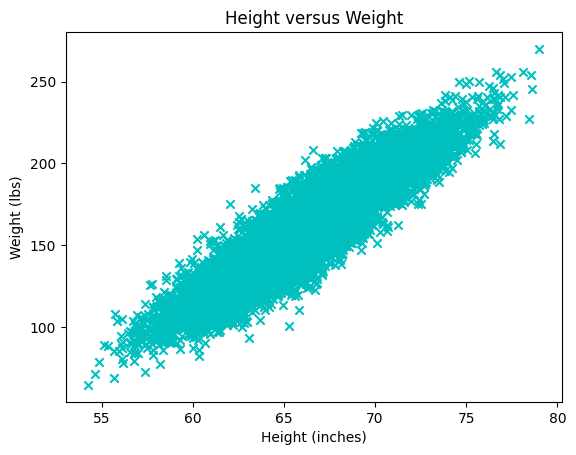
Question f#
Explain the following plot. What does each point/mark correspond to?
plt.scatter(x=height, y=weight, color='c', marker='x')
plt.title("Height versus Weight")
plt.xlabel("Height (inches)")
plt.ylabel("Weight (lbs)")
plt.plot()

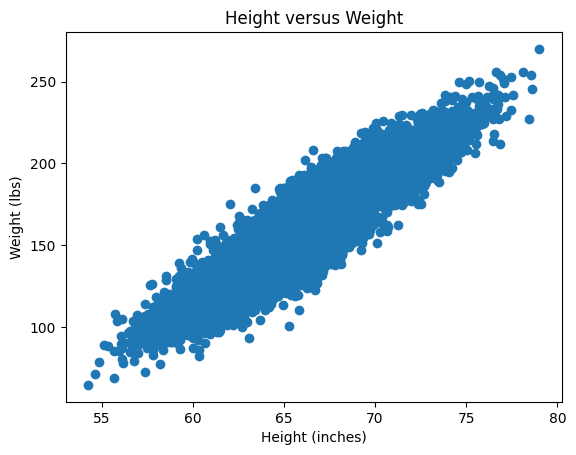
Question g#
Explain what the following data matrix contains:
X = np.array([height, weight]).T
X.shape

# The first 10 rows
X[0:10,:]   # Or just X[:10]
array([[ 73.84701702, 241.89356318],
       [ 68.78190405, 162.31047252],
       [ 74.11010539, 212.74085556],
       [ 71.7309784 , 220.0424703 ],
       [ 69.88179586, 206.34980062],
       [ 67.25301569, 152.21215576],
       [ 68.78508125, 183.9278886 ],
       [ 68.34851551, 167.97111049],
       [ 67.01894966, 175.9294404 ],
       [ 63.45649398, 156.39967639]])
Question h#
Write a Python function that computes the average of each column in the \(X\) matrix.
def average_of_each_column(X):
    # Add code
    return X[0,:]  # Fix this to return the average of each column
The output (after return) should be a Numpy array with a shape of (2,), so, a mean vector of size 2. Check your function by calling:
X - average_of_each_column(X)
Hint
The easiest will be to use a built-in method. See https://numpy.org/doc/stable/reference/generated/numpy.mean.html.
Question i#
We will now standardize the data, which in this exercise simply means centering the set of points (the data “cloud”) at \((0,0)\). More precisely, in each column of \(X\), the column average should be subtracted from each element in that column.
def centered(X):
    return X - average_of_each_column(X) # 'Broadcasting' the vector as we saw above

X_st = centered(X)
Plot the new standardized data set \(X_{st}\) and confirm that it is indeed centered at \((0,0)\).
Hint: Remember that the data set \(X\) can be plotted with:
plt.scatter(X[:,0], X[:,1]) # X[:,0] is height, X[:,1] is weight
plt.title("Height versus Weight")
plt.xlabel("Height (inches)")
plt.ylabel("Weight (lbs)")
plt.plot()
You just have to do the same for \(X_{st}\).
Covariance Matrix#
Question j#
We will briefly return to the mathematics and ask you to prove the following:
Let \(X\) be an arbitrary real \(n \times k\) matrix. Prove that the \(k \times k\) matrix \(C\) given by \(C = X^T X\) is symmetric. Argue that \(C\) has real eigenvalues and \(k\) orthogonal eigenvectors.
Question k (Optional)#
Prove that \(C\) is positive semi-definite and therefore cannot have negative eigenvalues. You may skip this exercise and return to it later.
Question l#
We return to the standardized data matrix \(X_{st}\) and calculate the \(C\) matrix by:
C = 1/(X_st.shape[0]-1) * X_st.T @ X_st
C
array([[  14.80347264,  114.24265645],
       [ 114.24265645, 1030.95185544]])
The matrix \(C\) is called the (sample) covariance matrix. The constant 1/(X_st.shape[0]-1), which is \(1/(n-1)\), is not important for our purposes. But we are interested in the eigenvalues and eigenvectors of \(C\), which we can find with the call:
lamda, Q = np.linalg.eig(C)
lamda, Q
(array([   2.11786479, 1043.63746329]),
 array([[-0.99389139, -0.1103626 ],
        [ 0.1103626 , -0.99389139]]))
Show that the columns of \(Q\) are already normalized. From here it follows that \(Q\) is a real orthogonal matrix. Why?
PCA and Orthogonal Projections of Data#
Question m#
Create a \(2 \times 2\) projection matrix \(P\) that describes the orthogonal projection onto the eigenspace corresponding to the largest eigenvalue of \(C\). Let \(\pmb{x}_k\) be the \(k\)’th row in \(X_{st}\), thus containing the weight and height of the \(k\)’th test subject. As a column vector this is written as \((\pmb{x}_k)^T\), which we can project onto the eigenspace corresponding to the largest eigenvalue by \(P (\pmb{x}_k)^T\). If we want to do this for all test subjects we thus simply have to calculate \(P (X_{st})^T\). The matrix \(X_{st}\) has the size \(n \times 2\), while \(P (X_{st})^T\) is \(2 \times n\), so we transpose it in order to match the size of \(X_{st}\). Altogether: \((P (X_{st})^T)^T = X_{st} P^T\).
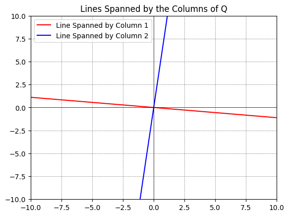
First, create the \(P\) matrix. Remember that you can extract, e.g., the second column of \(Q\) by q2 = Q[:,1]. Check that \(P\) is a \(2\times 2\) projection matrix.
Then plot the standardized data set \(X_{st}\) along with the projected data set \(X_{st} P^T\). You should obtain a plot looking something like this:
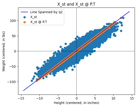
About the Python plot: You can plot subspaces spanned by columns of a matrix by using the following code:
q1 = Q[:,0] # The first column
q2 = Q[:,1] # The second column

# Define a range for t, which will be used to extend the lines
t = np.linspace(-10, 10, 2)

# Plotting
fig, ax = plt.subplots()
# For each vector, plot a line that it spans
ax.plot(t*q1[0], t*q1[1], 'r', label='Line Spanned by Column 1')
ax.plot(t*q2[0], t*q2[1], 'b', label='Line Spanned by Column 2')

# Adjust the plot limits and style
plt.xlim(-10, 10)
plt.ylim(-10, 10)
plt.axhline(0, color='black',linewidth=0.5)
plt.axvline(0, color='black',linewidth=0.5)
plt.grid(color = 'gray', linestyle = '--', linewidth = 0.5)
plt.legend()
plt.title('Lines Spanned by the Columns of Q')

# Display the plot
plt.show()
Our data set \(X\) (and \(X_{st}\)) has two components, namely two eigenvalues/eigenvectors. By the projection \(X_{st} P^T\) we are doing a dimensional reduction (from two to one) onto the most important dimension of the data set. In this example, it is not appropriate to do this dimensional reduction, as the variances in weight and height both are important, but we have made the best representation if we only keep one “component/coordinate vector”.
If the data \(X_{st}\) had \(k\) columns and the \(C\) matrix thus became \(k \times k\) with \(k\) eigenvalues, it would be appropriate to perform an orthogonal projection of \(X_{st}\) onto the subspace of \(\mathbb{R}^k\) that is spanned by eigenvectors associated with the “largest” eigenvalues, as this would contain the “most important” components. If the eigenvalues of \(C\) are, say, \(1,0.7,0.5,0.01,00.1\), then \(P\) should make an orthogonal projection on the subspace spanned by eigenvectors associated with the three largest eigenvalues.
Question n#
Instead of looking at the projection in the original 2D space (as in the previous Question), we can find the coordinate (the position) of the point on the eigenvector axis corresponding to the most important component. This is done by \(Z=X_{st}\pmb{q}_{2}\). Explain why we will choose the \(\pmb{q}_2\) vector. Explain what dimension \(Z\) has and why this is called dimensional reduction. \(Z\) is usually called PCA scores.
Question o#
Let us have a look at some data matrices \(Y\) with three columns where we can consider \(Y\) as a set of points in \(\mathbb{R}^3\). The data matrices \(Y\) in the code below are generated “randomly”, though according to the rules:
\(Y\) is standardized (each column has an average of zero),
The eigenvalues of \(C= \frac{1}{n-1} Y^T Y\) are approximately equal to \(\lambda_1, \lambda_2. \lambda_3\), which are given by the user in the line
eigenvalues = [5, 1, 0.04].
# Function to generate a synthetic data set
def generate_3d_data(eigenvalues, size=1000, dim=3):
    # Eigenvalues specified by the user
    assert len(eigenvalues) == dim, "There must be exactly dim eigenvalues."

    # Create a diagonal matrix for the eigenvalues
    Lambda = np.diag(eigenvalues)

    # Generate a random orthogonal matrix (eigenvectors)
    Q, _ = np.linalg.qr(np.random.randn(dim, dim))

    # Generate random data from a standard normal distribution
    data_standard_normal = np.random.randn(size, dim)

    # Transform the data using the square root of the covariance matrix
    data_transformed = data_standard_normal @ np.sqrt(Lambda) @ Q.T

    # Construct the covariance matrix
    Cov = 1/(size-1) * data_transformed.T @ data_transformed

    return data_transformed, Cov

# Eigenvalues you want for your covariance matrix
eigenvalues = [5, 1, 0.04]

# Generate the data
Y, C = generate_3d_data(eigenvalues)
We can plot the data matrix \(Y \in \mathbb{R}^{1000 \times 3}\) as 1000 data points in \(\mathbb{R}^3\):
# %matplotlib qt   # Show plot in a new, rotate-able window by removing the #

fig = plt.figure()
ax = fig.add_subplot(111, projection='3d')
ax.scatter(Y[:,0], Y[:,1], Y[:,2], c='b', marker='x')
ax.set_xlabel('first column')
ax.set_ylabel('second column')
ax.set_zlabel('third column')
plt.title('3D Scatter Plot of Synthetic Data')
plt.show()
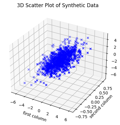
Choose different positive \(\lambda_1, \lambda_2, \lambda_3\) in eigenvalues = [5, 1, 0.04], and investigate the set of points that appears by rotating the plot (you need to activate %matplotlib qt by removing the #). Try both with examples where \(\lambda_1\) is much larger than \(\lambda_2, \lambda_3\), and where \(\lambda_3\) is much smaller than \(\lambda_1\) and \(\lambda_2\). How does the set of points change shape with changing eigenvalues?
Consider this (a loosely-formulated statement): The eigenvalues in \(C\) are, loosely stated, given by the semi-axes of the ellipsoid that can “cover” the most data points. The directions of the symmetry axes of the ellipsoid are given by the eigenvectors. Less-important “components” lie in directions along which the ellipsoid is “flat”.
Answer
Large \(\lambda_1\) and small \(\lambda_2, \lambda_3\): The data cloud becomes a stretched “cigar” or “needle” along the \(\pmb{q}_{1}\) axis.
Large \(\lambda_1 \approx \lambda_2\) and small \(\lambda_3\): The data cloud becomes flat as a “pancake” in the plane spanned by \(\pmb{q}_{1}\) and \(\pmb{q}_{2}\).
\(\lambda_1, \lambda_2, \lambda_3\) all of the same size: The data cloud becomes sphere-shaped without dominant directions.
Question p#
In this Theme Exercise we will center the data set by extracting the mean value from each column. It can also be useful (if not necessary) to “scale” the data such that all columns have the same spread/standard deviation (meaning the variation is the same in all columns). This standardization is called \(z\)-score normalization, where the data is transformed such that all columns get a mean value of \(0\) and a spread of \(1\).
Discuss when it can be necessary to standardize the data in this way (before the covariance matrix is calculated and PCA carried out).
Hint
Consider the following points in your discussion:
When the variables are measured in different units (such as centimetres vs. kilograms), those with larger “units” can dominate the covariance measurements.
If you have a variable measured in millimetres and one in kilometres, the millimetre variable will have a numerically much larger variance although it might be less important.
If the variables have very different spreads, the variable with the largest variation can risk determining the found principal components even if it might not be the most important one for the task.
The use of \(z\)-score normalization ensures that all variables contribute equally to the analysis as they then all have the same measure of spread.
Also discuss whether situations may arise where it is not appropriate to scale the data, such as if the absolute variance is an important part of the interpretation of the data.
Answer
Necessary: When the units are different (such as income in Danish kroner vs. age in years). Otherwise PCA will just point towards the variable with the largest numerical values.
Not necessary: If all variables have the same unit (such as pixels of an image or centimetres in biological measurements) and the relative difference in spread actually carries important information.
Optional: PCA on the Iris Data Set (4D)#
In this final part we will work with the famous Iris data set. This data set contains 150 observations of three different species of Iris flowers (Setosa, Versicolor, and Virginica). Each flower is described by four physical measurements (features): sepal length/width and petal length/width.
The purpose of this part is to investigate whether these four physical measurements are sufficient to distinguish between the three species of Iris flowers. As we cannot visualize four dimensions, we will use PCA as a “mathematical projector” to transform the data.
We wish to see whether the flowers naturally appear as three separate groups (clusters). If the species gather in groups, then that is proof that their physical differences are sufficiently systematic for a mathematical classification of the flowers.
First we will import the data. Install scikit-learn (if you don’t have it already) by typing conda install scikit-learn in your terminal in VS Code. Then do the import:
from sklearn.datasets import load_iris
import matplotlib.pyplot as plt
import numpy as np

iris = load_iris()
X_iris = iris.data    # 150x4 matrix (measurements)
y_iris = iris.target  # Vector indicating species (0, 1, or 2)
names = iris.target_names
Question q: Visualization of Raw Data in 3D#
As we live in a 3-dimensional world, we cannot visualize all four coordinates at once. Therefore, we will begin by “throwing away” a coordinate and plotting the first three measurements directly.
Use the following code to see the data in \(\mathbb{R}^{3}\):
# %matplotlib qt
fig = plt.figure(figsize=(8, 6))
ax = fig.add_subplot(111, projection='3d')

# We choose the first 3 of the 4 columns for x, y, and z axes
colors = ['r', 'g', 'b']
for i in range(3):
    ax.scatter(X_iris[y_iris == i, 0],
                X_iris[y_iris == i, 1],
                X_iris[y_iris == i, 2],
                c=colors[i], label=names[i])

ax.set_xlabel(iris.feature_names[0])
ax.set_ylabel(iris.feature_names[1])
ax.set_zlabel(iris.feature_names[2])
ax.set_title("Direct measurements in 3D")
ax.legend()
plt.show()
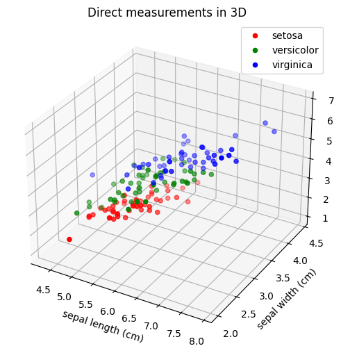
Is it easy to separate the three species from each other based on these projections of direct measurements? What are we losing by ignoring one of the four measurements? Can you separate the three species if you choose other direct measurements than the first three?
Note
Remove the comment symbol in front of # %matplotlib qt if you want to be able to rotate the 3D plot in a separate window.
Question r: Covariance and Eigenvalues#
In order to perform a more meaningful dimensional reduction than simply deleting a column, we will use PCA.
Standardize the data: Extract the mean value from each column in \(X_{iris}\), such that the data is centred at the origin. Denote the result by \(X_{st}\).
Compute the covariance matrix: Compute \(C=\frac{1}{n-1}(X_{st})^T X_{st}\), where \(n=150\). What is the dimension of this matrix?
Find the eigenvalues: Compute the four eigenvalues of \(C\).
Find the dominant eigenvectors: Identify those eigenvectors that correspond to the three largest eigenvalues. Denote them by \(\pmb{q}_{1}, \pmb{q}_{2}, \pmb{q}_3\).
State \(\pmb{q}_{1}, \pmb{q}_{2}\), and \(\pmb{q}_3\).
Question s: From 4D to 3D via Principal Components#
We will now project the data onto a 3D subspace by using the three most important principal components (the PCA directions \(\pmb{q}_{1}, \pmb{q}_{2}, \pmb{q}_{3}\), corresponding to the three largest eigenvalues). We form the matrix \(Q_{reduced}=\left[\pmb{q}_{1},\pmb{q}_{2}, \pmb{q}_{3}\right]\) of size \(4\times 3\) .
The new 3D coordinates (also called the PCA scores) are calculated as:
Finish the following code and comment on the result:
Q_reduced = ...         # Remember to sort them after largest eigenvalues
Z = X_st @ Q_reduced    # The projection

fig = plt.figure(figsize=(10, 8))
ax = fig.add_subplot(111, projection='3d')

colors = ['r', 'g', 'b']
for i, target_name in enumerate(names):
    # We use the three columns of Z as, respectively, x, y, and z coordinates
    ax.scatter(Z[y_iris == i, 0],
               Z[y_iris == i, 1],
               Z[y_iris == i, 2],
               c=colors[i],
               label=target_name,
               s=50)

ax.set_xlabel('Principal Component 1')
ax.set_ylabel('Principal Component 2')
ax.set_zlabel('Principal Component 3')
ax.set_title('PCA with 3 coordinates')
ax.legend()

plt.show()
What does the plot tell you about the three flower species compared to the 3D plot in Question q? Is it now possible to distinguish the species from each other even though we still only consider three dimensions and not all four?